Data engineering with PySpark
How can a reproducible Spark pipeline turn county-level reporting records into interpretable summaries?
University coursework
Local-mode processing of reported case increases. Reporting backlogs, revisions and clamped corrections prevent interpreting the chart as true infection incidence.
The evidence
Fig. 01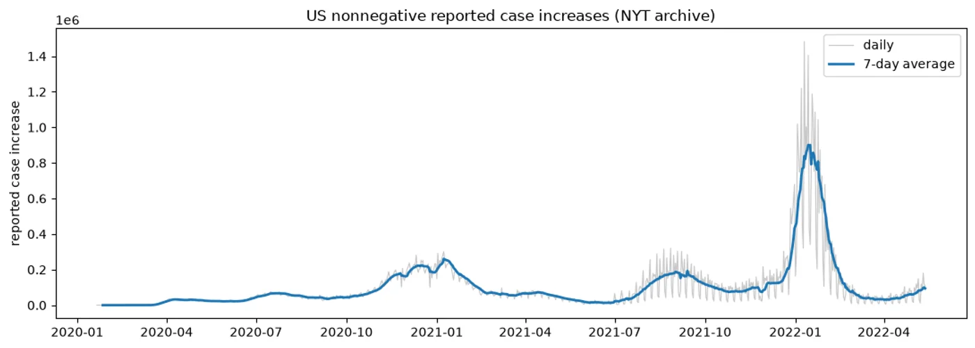
01 · Method and interpretation
A schema-first PySpark pipeline over 2,502,832 archived New York Times county-day records from 21 January 2020 through 13 May 2022. It preserves unknown death counts, derives nonnegative reported case increases with a county window, takes each county’s latest record before rolling up state totals, queries reporting peaks in Spark SQL, and writes a small result table. The source commit and SHA-256 are pinned. The chart reflects report dates, backlogs, revisions, and clamped negative corrections—not true infection incidence—and local mode demonstrates the APIs without claiming cluster-scale execution.